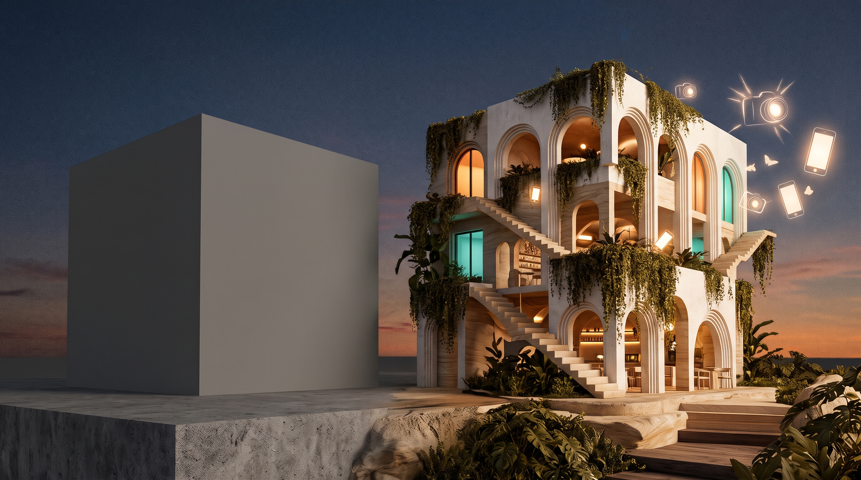
In standard growth marketing, customer acquisition is an expensive treadmill. You bid for Meta clicks, build conversion funnels, chase algorithmic trends, and pray that rising customer acquisition costs (CAC) don’t cannibalise your operating margin.
Yet a handful of physical businesses in Sydney operate on an entirely different economic model: design-led acquisition.
Brands like One Playground, BAKED and The Grounds of Alexandria have rendered traditional performance ad spend virtually obsolete. By transferring conventional marketing budgets directly into interior architecture, lighting design and sensory staging, they have turned their physical footprint into an automated media production hub.
Their customers do 100% of the content distribution — voluntarily, consistently and at zero media cost.
Why the featureless box is dying
For the past decade, commercial spaces adhered to a copy-paste Pinterest aesthetic:
- Monochromatic limewash or cold concrete micro-cement.
- Unflattering overhead LED flat panels (4000K+) casting heavy shadows.
- Identical blonde plywood joinery and a solitary potted fiddle-leaf fig in the corner.
While this minimal look felt contemporary in 2017, monochromatic, concept-free venues are shuttering across the board today. The reason is structural: they offer zero visual currency.
A sterile space fails to give the customer any social incentive to pull out a phone, photograph their surroundings or share their visit. Without an organic visual hook, these businesses become completely reliant on paid ads, discount promotions or third-party delivery apps to survive.
Conversely, venues that generate persistent queues treat physical architecture not as a utility, but as an experiential set that delivers instant social proof.
1. One Playground: spatial psychology and the “drop” playbook
Gyms historically defaulted to two deeply flawed archetypes: the intimidating, subterranean basement box, or the soulless, cavernous industrial warehouse where members feel lost among acres of grey steel.
One Playground approached physical fitness through the lens of luxury hospitality and architectural curation.
The 2,000 m² sweet spot
The footprint is deliberately engineered to balance comprehensive equipment availability with atmospheric density. Members never feel crowded, yet the floor plan avoids the sterile emptiness of massive commercial mega-gyms.
Studio-grade lighting architecture
Instead of harsh, vertical overhead light tubes, spaces are mapped with dedicated lighting temperatures and angles. Weight-training floors use dramatic, high-CRI directional downlights that enhance muscular definition. Studio and wellness areas transition into soft, indirect ambient warmth.
The built-in UGC mirror
Vanity mirrors throughout the facilities and locker rooms integrate concealed frontal diffused fill lighting (CRI 90+). The camera captures an immaculate, flattering shot on the first attempt, without harsh under-eye shadows. The result: thousands of organic, branded mirror selfies stream onto Instagram and TikTok daily, giving the brand continuous organic reach without paying an influencer roster.
Streetwear-style “drop” mechanics
Rather than treating club openings as routine logistical additions, One Playground borrows mechanics from sneaker culture. Location teasers, interactive community guessing games and architectural renders drum up organic buzz months in advance. By opening day, membership caps are frequently met through pre-sale anticipation alone.
2. BAKED: cultural alignment and theatrical indulgence
The operational engine behind BAKED shows how identifying an underserved social dynamic, paired with bold product staging, builds an organic referral loop.
The alcohol-free third space
Mainstream evening hospitality traditionally leans on alcohol sales to support margins. However, this leaves Muslim families and non-drinking groups with limited options for elevated, late-night socialising free from rowdy bar crowds. By committing to a design-forward, alcohol-free venue trading until 10 pm, BAKED provided a dignified destination for social connection.
Camera-ready scale
The menu is engineered for visual impact. Cake portions are sliced to the dimensions of an actual building brick, and specialty beverages — such as layered ceremonial-grade matcha priced at $14–$16 — feature striking, multi-tiered presentations. These items are designed to be photographed before they are tasted.
The word-of-mouth flywheel
Because the venue deeply aligns with the community’s core social values, existing patrons bring extended family, friends and colleagues. Word-of-mouth referral replaces digital ad spend.
3. The Grounds of Alexandria: narrative world-building and cyclical visits
Enduring a 60-minute wait for a table is an operational friction point that would shutter most cafes. The Grounds turned that wait into an accepted ritual by operating less like a brunch spot and more like a botanical production set.
Set-piece rotation
Most venues treat fit-outs as a long-term capital expense meant to depreciate over a decade. The Grounds treats interior design like dynamic stage production. By frequently overhauling large-scale seasonal themes and floral installations, they continuously reset the consumer visit cycle. A patron who visited three months ago has an immediate reason to return today, because the backdrop has completely evolved.
Tactile presentation
Plating a burger on an actual garden shovel reinforces the rustic greenhouse narrative through a tactile, unexpected visual cue. It breaks table monotony and prompts diners to post to social media immediately.
Botanical immersion
Stepping off an industrial inner-south street into a lush, dense horticultural sanctuary delivers immediate sensory escapism, solidifying the venue as an intentional destination rather than a quick transactional stop.
Design-led acquisition vs traditional paid marketing
How a generic monochromatic venue compares with a design-led destination like One Playground, BAKED or The Grounds:
Core principles for physical venues
Building a space that acquires customers organically comes down to three spatial rules.
- Light for the lens first. If overhead lighting casts harsh shadows under eyes or washes out skin tones in mirrors, organic UGC will not happen. Diffused fill light with high colour rendering (CRI 90+) is an operational necessity.
- Design an unapologetic visual anchor. Every venue needs a standout signature that breaks convention — whether it’s an oversized portion, eccentric service ware or an immersive entryway.
- Calibrate spatial scale. Balance density and comfort. In large fitness or hospitality venues, avoid vast, hollow zones by creating distinct lighting pockets and intimate spatial zones where visitors feel energised rather than isolated.
When physical spaces are intentionally built as aesthetic destinations, your patrons take over the acquisition funnel — turning word-of-mouth into a reliable, zero-ad-spend growth engine.
Want to know what’s really bringing customers through your door?